
Having a good website for your business is non-negotiable. Potential customers or clients are pretty much guaranteed to look at a business’s website before buying your services. People want to make up their minds about you first. And nowadays, people aren’t pulling out their laptops or booting up a desktop as often to learn about your business. They are going to pull out their phones and search for you there. What would they find when searching for your business’ mobile site? Would they find a site that is user-friendly and shows them who you are quickly?
You might be the best at what you do, but if your mobile site is bad—you have potential customers and clients clicking away and looking elsewhere.
There are lots of factors that go into creating a mobile-friendly website. In this blog post, we are going to keep it simple & go over a few of the big ones and give you some questions to ask yourself.
Responsive Mobile Site vs. Adaptive Mobile Site – Which one is best for your business?
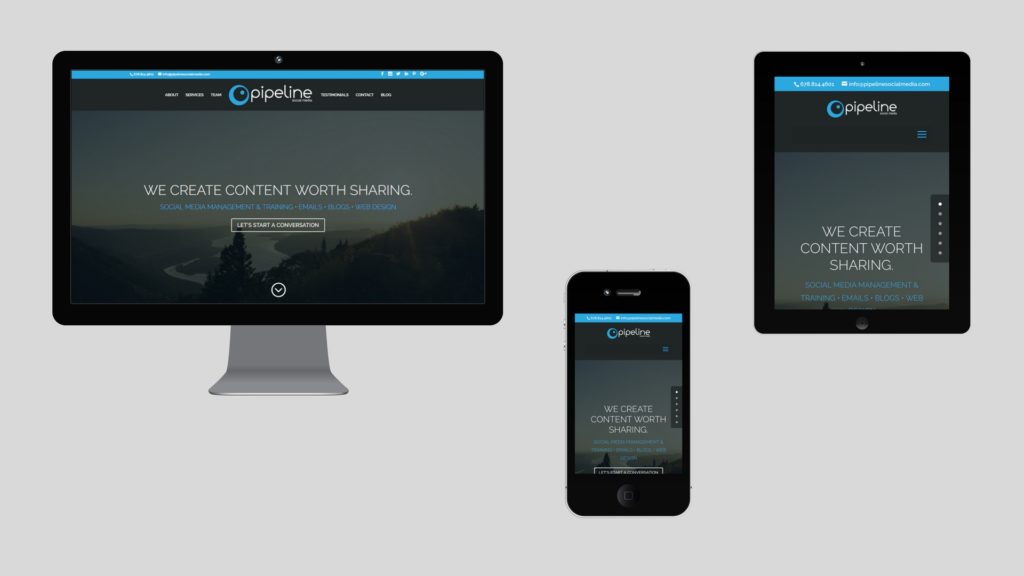
You have two choices for your mobile site—adaptive or responsive web design.
An adaptive site adapts to the device you are using by loading the corresponding site. With this option, you would need a different website for mobile, desktop, and tablets. A responsive site looks the same across all devices, but the elements will shift or rearrange themselves to best fit the screen.
There are pro’s and con’s for both options . . .
Adaptive Site-
Pros:
- Since you are able to create the best experience for each device, you wouldn’t have to worry about certain functions not translating well from one platform to the next. You can have one website that works perfectly on desktop and another version that works perfectly on mobile etc.
- Often, load time is better. If a site is made for the device, it makes since that it could be faster than a responsive site.
Cons:
- Creating several websites takes more time and is more expensive.
- It is not as good for your sites SEO rankings. We’ll go over this more in a second.
Responsive Site-
Pros:
- Your business website will work across all platforms. The contents of your site will adjust and resize to fit whatever screen is being used.
- Having one single version of your site is much better for SEO rankings. Google doesn’t like seeing multiple websites with the same content. Check out Google’s SEO Guidelines.
Cons:
- Without putting the proper thought into creating your responsive site, it might not adjust well between platforms. You or whoever is creating the site needs to consider text size, text volume, whether the video platforms translates on all devices . . . all of the elements need to be flexible. Your site may still work alright without bothering with those details, but it will most likely look just plain ugly.
- Your responsive website isn’t tailored for every platform like adaptive sites can be. If a lot of love and care did not go into the creation of your responsive website, it will load slowly & it won’t be user-friendly.
The Pipeline Team is partial to responsive design, so that is what we’ll be discussing from here on out. Let’s talk about a few things that your business website needs to work well across all platforms.
Keep it clean and simple
As we mentioned earlier, the elements of your site need to work well on multiple platforms. Here’s a list of things that you or your web developer need to consider regarding responsive web design:
- Buttons– How do the sizes translate across devices? Do the words on buttons fit the same? Where are they positioned?
- Text– Does it need to be simplified & cut down in order to look good on all devices. How does the text size look across the board?
- Pictures– How do they resize themselves? Is the composition off?
- Videos– Are they playing correctly on all devices? You might need to switch the plug-in.
- Dropdown menus– Do you have dropdown menu icon? Can you see the full menu?
Basically, you don’t want any elements pushing any other elements around and throwing off the composition of your site. When users come to your site, they don’t need to be doing any of the thinking. Your site should be arranged in a way that leads them where you want them to go and everything should be easy to find. That means—
- keeping consistent themes throughout your whole site. Pages that have similar functions should look the same and all of the pages of your site should look like they belong to the same family.
- you should be able to get to anywhere on the site from anywhere on the site.
- contact information and social bars should be easily accessible.
- the site can’t be over cluttered and text blocks are only as long as they need to be.
- there should be “call to actions” throughout the site so users know how you want them to respond to the content. Ex. “purchase here” or “learn more here” buttons etc.
We could go on . . . The main thing is to keep it simple. The easier it is for people to use your site, the better.
With all of these things in mind, how does your business’s mobile site measure up? Put your website to the test by pasting the URL in this Mobile-Friendly Test.
If your website needs some work, don’t worry! You have a few options on how to fix it.
- If you are a DIY kind of person, do some research on what makes a website mobile-friendly and improve your business’ website. All of the knowledge in the world is on the internet! We will be posting more advice on this topic as well.
- Consider moving your site to a user-friendly web developing platform where you can choose responsive templates. Like Wix, WordPress, or Squarespace.
- Hire our in-house web developers to create a responsive site for you!
We hope this article got you thinking on the importance of having a mobile-friendly website. We share blog posts like this all the time on how you can improve your business’s online presence! If you enjoyed this post, check out “Pipeline Social Media-Now Offering Websites” Thanks for reading!
Pipeline Social Media is a digital marketing agency that offers three approaches to help you increase your social media presence: we can fully manage your social media accounts, we can teach your team how to do it in-house, or we can monitor/coach your team along the way and report back to you. Ask us about our Google AdWords management, web design, and SEO website packages.
Maiya Wall
Social Media Community Manager
Pipeline Social Media